PROJECTS feature articles
Sense of grandeur
Home & Architectural Trends, volume 2706
Large, bold forms have an appeal all their own. However, creating a residence that evokes space and serenity is as much about restraint as it is about scale—less is often far more.
This substantial house represents an evolving collaboration between the owner and interior designer Sharon Kiss. Over the years they have worked together on successive traditional homes, followed by a soft-contemporary condominium. With this project, a clean-lined, modern, minimalist house, the transition in styles is complete. Designer Matthew Rao created the understated kitchen.
The owner had conceived the design some years before and adapted it to suit the stepped-down site. As the house is in an established suburb, white stucco was a logical choice for the facade—appropriately modern, yet in keeping with its more classically styled neighbors, he says.
“Monumental white wall planes are topped with a band of stainless steel on the parapet and punctuated with views into the double-height atrium.”
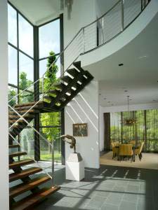
The sense of interior drama glimpsed from the street intensifies on the approach to the solid wood front door and on stepping into the atrium. The layout of the main level of the three-story home is as simple as it is breathtaking. From the atrium, the dining area is at left, with the expansive living space on the right. These areas connect via a kitchen and hallway, creating a circuit through the house.
“Steps down to the living area and a hierarchical change in ceiling heights delineate the shift in spaces,” the owner says. “After the 30ft-high atrium, the living area has the next highest volume, at 18ft.”
Shifts in scale apart, the rooms have an understated appeal, says Sharon Kiss.
“There are no baseboards, no crown mouldings, no millwork at all. The pared-back decor is all about letting the artwork take center stage,” says Kiss. “These bring color highlights, while shifts in texture and material high points, such as wooden stair treads on the spiral staircase and a panel of roughcast concrete opposite the front door, create more subtle nuances.”
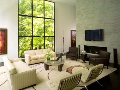
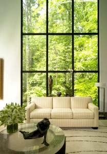
The absence of window casings and drapes in the main living area ensures nothing detracts from the leafy forest outlooks to the rear of the home. Together with the artwork, the expanses of greenery bring color highlights to the mainly beige, gray, silver and black color palette seen throughout the living spaces.
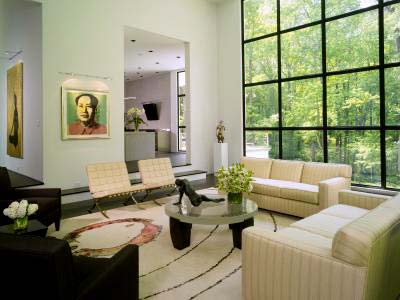
“In keeping with the walls, the floors are in a restrained, gray porcelain tile. Large area rugs warm up the expanses of flooring. The living area rug was designed for the space and is laid off center so it is not hidden by furniture placement,” says Kiss. “The textured concrete panel in the entry is repeated as a floor-to-ceiling fire surround in this room. This partition wall screens a study area that provides a more intimate space for the owner to work in.”
Existing sofas are accompanied by classic leather-upholstered Barcelona chairs and a 4in-thick fused-glass coffee table with blackened steel legs. This also adds a subtle touch of color.
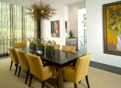
In the dining area, drapes provide light control and privacy. The delicate material creates a morphing effect that catches the eye. Other features of the room include the solid wood dining table, and a polished nickel and stainless steel light fixture. A rug in abaca woven with suede adds texture and a down-to-earth touch.
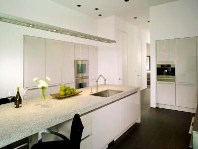
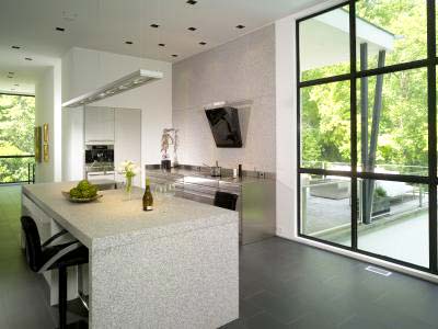
As a through space, the kitchen had to take on the look of the adjacent rooms. This is the third kitchen design Matthew Rao has created with the owner.
Free-flowing and refined, this new kitchen is light on visual extras, more focused on essential functions, says Rao.
“As a result, this is an eat-in space with plenty of counter space and no separate breakfast table. It also makes an informal spot for Doug to watch television in or just hang out with a couple of friends.”
The kitchen opens to the living room at one end, with a hall leading to the butler's pantry and the dining room at the other.
“This space was designed to be as minimal and as little like a classic kitchen as possible. Repetition of 2ft sizing in the tall cabinets and appliances plays off the grid of the windows opposite,” says Rao. “Gloss lacquer reflects both light and the forest views. This is a material contrast to the matt, textured palette of other rooms.
“The hood, which reads more like a piece of wall sculpture than ventilation, stands against a grid of granite slabs—a functional canvas to the cooktop wall.”
Most of all, the interior of the house brings to mind the cool calm feel of an art gallery. From the Warhol screenprint in the living room to the sculptural range hood, the home celebrates purity of form and artistry at every turn.
